
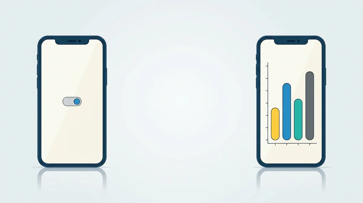
Screenshot the result, not the switch. If your app is a background service, a widget or a single toggle, the persuasive image is what the user gets: the widget on a home screen, the notification that arrives, the chart of what it saved, or a before and after pair. Both stores still want a real app screen in the frame, so put the outcome inside one.
What do you screenshot when there is nothing to show?
Quick answer: The result, not the switch. A background app's value happens after the screen closes, so the image that sells it is the outcome: a widget sitting on a home screen, the notification it sends, a chart of what it saved, or a before and after pair.
A picture of an on off toggle tells a store visitor nothing. They already know what a toggle looks like.
I read both stores' rules on what a screenshot has to contain before writing this, and I checked that overlays are explicitly allowed, because this whole approach depends on them.
Which apps have this problem
More than you'd think, and they all share a shape.
Background services that sync, back up or clean. Battery and storage tools. Automation apps that run without you. Widget first apps. Companion apps for a watch or a device.
In every case the app's value lands somewhere other than the app's own screen.
That's not a design flaw. For a lot of these, the best version of the product is the one you open least.
But it makes the store listing genuinely hard, and the usual advice about showing your main feature doesn't help.
Screenshot the outcome
This is the whole method in one line, so here's what it looks like in practice.
A backup app shows the list of what it backed up, with dates and file counts.
For a battery app it is the hours gained, on a chart, with a number big enough to read at thumbnail size.
Cleaners show the space recovered. And a sync app can show the same file open on two devices.
Notice that every one of those is still a real screen from the app. You're choosing the screen that carries the result rather than the screen that carries the button.
The home screen is a legitimate screenshot
For widget apps this is the single most useful thing to know.
If your app's main output is a widget, then a photograph of a phone home screen with your widget on it is a picture of your app working.
It's also the exact thing the user is deciding about. They want to know what their home screen will look like afterwards.
Same for a lock screen widget, or a notification in the shade.
Keep the rest of the home screen tidy and generic. A row of unrelated app icons pulls attention away, and somebody's real messages in a notification is a privacy problem.
Before and after pairs
The strongest format for this category, and it's underused.
Put two phone frames side by side in one image. Left is the problem, right is after your app has done its job.
Storage full against storage recovered. Cluttered against organised. Six apps against one.
The pair carries the whole argument without a paragraph of text, and it reads at thumbnail size, which is where the decision happens.
The one rule is that both sides must be real. A staged before that you constructed to look worse than reality is the kind of thing that ends up in a one star review.
Let the caption do more work than usual
Captions matter everywhere. Here they carry the meaning.
Apple's guidelines say screenshots may include text and image overlays, so a caption on top of a real screen is expected rather than tolerated. You can read the exact line in Apple's review guidelines.
So the caption explains what the quiet screen is doing. Runs every night without opening the app. Saved 4 hours of battery this week.
That pairing is the trick. The screen proves it's a real app, the caption says what happened.
We covered how to write those lines in our guide to screenshot captions that convert.
The notification is part of your product
Worth treating as a designed surface rather than an afterthought.
For a lot of quiet apps, the notification is the only thing the user sees for weeks at a time. It is the product, as far as they are concerned.
So a screenshot of a well written notification, sitting in the shade at the right moment, shows the real experience better than the app screen does.
Write the notification text properly before you capture it. A placeholder string in a store screenshot is the sort of thing people notice and nobody forgets.
And blur or replace anything personal in the notifications above and below yours.
The settings screen is not a feature
A trap that catches utility apps specifically.
When the main screen is empty, the settings screen looks like the busiest thing you own. It has toggles, sections and options, so it looks substantial.
It isn't. A list of switches is a picture of work the user has to do.
The exception is when a specific setting is the reason people install. A privacy app showing exactly what it blocks is a real argument.
Even then, show the setting doing something rather than the full list of them.
Numbers make a quiet app visible
Some concrete things to put on screen when there's no interface to show:
- What it processed, such as files backed up or hours protected.
- What it saved, such as storage recovered or battery gained.
- How long it's been running without you touching it.
- A simple chart over a week or a month.
A number the app genuinely produced is a demonstration, not a claim, so it's safe ground.
A number about your company's popularity is a different thing entirely, and the stores treat it differently.
Both stores still want the app in the frame
This is the boundary on everything above, so it's worth stating plainly.
Google asks that screenshots demonstrate the actual in app experience and focus on core features, and its asset requirements set the sizes that go with it.
Apple asks that screenshots show the app in use rather than title art or a splash screen.
So an image made purely of illustration, icons and marketing copy isn't a screenshot however good it looks.
Keep a real screen in every frame, then decorate around it. That's the difference between a designed screenshot and a poster.
Video does a lot of the work here
One honest observation about this category.
A still image struggles to show something happening over time, and time is exactly what a background app is selling.
A short preview video can show the toggle going on and the result arriving, which no single frame does.
That does not replace the screenshots, because the store shows both and many people never play the video. It supplements them.
If you only have budget for one, make the screenshots good first. The video is the second job, not the first.
Companion apps and other devices
A special case worth its own note.
If your app controls a watch, a speaker or a piece of hardware, the interesting picture usually includes the device.
A phone screen next to the thing it's controlling explains the product in a way neither one does alone.
What you can't do is imply a device you don't actually support, or use a manufacturer's product imagery you don't have the rights to.
Your own photograph of your own supported hardware is the safe version.
Keep the set consistent
One thing that matters more for this category than for busy apps.
When every screen is minimal, the design around them carries the listing. So a wandering background colour or a caption that changes size halfway through is far more obvious.
Use one background, one frame, one caption position and one type size across all of them.
That consistency reads as a product built by somebody careful, which is exactly the signal a quiet utility needs.
Our guide to background colour covers how to pick one that works at thumbnail size.
What to do now
Write down what your app actually gives the user, in one sentence, without mentioning the interface.
That sentence names the outcome you should be screenshotting.
Then find a real screen in your app that shows it, or build a before and after pair.
Drop it into the editor, add the caption, and export the set.
Frequently asked questions
What do I screenshot if my app runs in the background?
The outcome rather than the controls. Show what it processed, what it saved or what it produced, on a real screen from the app. A picture of an on off toggle tells a store visitor nothing they did not already know.
Can I use a home screen with my widget as a screenshot?
Yes, and for a widget app it is usually the best image you have. It is a picture of your app working, and it answers the exact question the visitor has, which is what their home screen will look like afterwards. Keep the rest of the screen tidy and generic.
Are before and after screenshots allowed?
Yes, and they are one of the strongest formats for a utility app. Two frames in one image, problem on the left and result on the right. Both sides must be real. A staged before made to look worse than reality invites complaints.
Should I use my settings screen as a screenshot?
Usually not. A list of switches looks busy but it is a picture of work the user has to do. The exception is a setting that is itself the reason people install, such as exactly what a privacy app blocks, and even then show it doing something.
Can my screenshots be illustrations instead of app screens?
No. Google asks that screenshots demonstrate the actual in app experience and Apple asks that they show the app in use. Overlays and captions on top of a real screen are fine. An image with no app screen in it at all is what gets flagged.
How many screenshots does a simple utility app need?
The same four minimum as any other app, because that is the eligibility bar for the recommendation formats. Four is achievable even for a one screen app once you count the outcome, a widget, a before and after pair and a chart. Our guide to [game and utility screenshots](/blog/game-vs-utility-app-screenshots-2026) covers the difference in approach.
Build the mockup in your browser.
Drop a screenshot into a real device frame and export at the exact store size — free, no signup.