
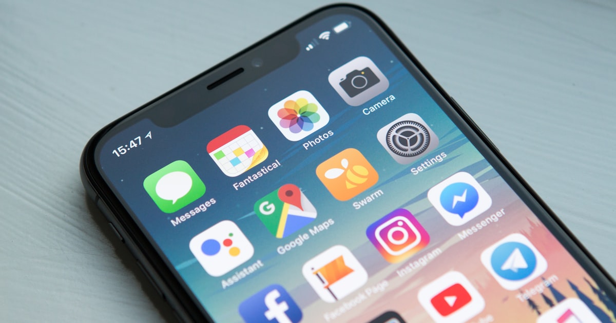
Your first screenshot has to work on its own, because roughly half of visitors never look past the first two and iOS renders the first three directly in search results for portrait apps. Lead with a single benefit stated in a short caption above the interface, not with a login screen or a feature tour. Treat the first frame as the thing that earns the tap and the rest of the set as the thing that closes the install.
Short Answer
Quick answer: Build the first screenshot to stand alone. On iOS the first three screenshots for portrait apps render straight onto the search result card, so people judge your app before they ever open the page. Measurements from SplitMetrics put the average product page visit at about seven seconds, with roughly half of visitors never looking past the first one or two frames.
That means one benefit, stated in a caption above the interface, in language somebody can read at thumbnail size. Everything else in your set is closing argument rather than opening.
Where Your First Screenshot Is Actually Seen
Most people design a screenshot set as though visitors arrive at the product page and scroll through it. That's the minority path.
Apple renders the first three screenshots inline on the search result card for portrait apps, so a large share of your impressions happen in a list alongside competitors, at a size where fine detail is invisible. The decision to tap or keep scrolling is made there.
Which changes what the frame has to do. It isn't explaining your app to somebody who has already shown interest, it's competing for attention against four other results in a fraction of a second. Those are different design problems and the second one is much harder.
Orientation matters here more than most teams realise. Portrait is the 2026 standard for good reason, and landscape sets show fewer frames in the initial view at a smaller size, which means bolder text and simpler compositions are needed to compensate. If your app genuinely suits landscape, plan for that cost rather than discovering it.
You can preview how a set reads at that size in the editor before shipping it, which is worth doing at actual thumbnail scale rather than zoomed in.
The Seven Second Problem
Seven seconds is the average time on a product page, and it explains nearly every screenshot mistake.
In seven seconds nobody reads a paragraph, studies an interface, or works out what your app does from context. They register one idea if you've given them one, or they register nothing and leave. Designing for a patient reader is designing for somebody who doesn't exist.
Half of visitors only look at the first one or two frames, and most never reach the fourth. Any information you've placed at position five is effectively decoration, which is uncomfortable if your best feature is sitting there.
So the ordering question is really a prioritisation question. What's the single reason somebody should install this, said in as few words as possible, and does the first frame say exactly that? Most sets fail this because they open with an onboarding screen or a home dashboard that means nothing to a stranger.
I've watched this pattern in a lot of listings and the first frame is almost always the most generic one in the set, when it should be the sharpest.
What Belongs in the First Frame
Three elements, and no more than three.
A caption stating one benefit, placed above the interface so it's read first. Three to six words, sentence case, no jargon, and phrased as an outcome rather than a feature. What the user gets, not what the app has.
One screen from your app, cropped so the relevant part is large. Showing an entire device screen at thumbnail size means showing nothing legible, so zooming into the part that matters usually beats a faithful full screen render.
A device frame if it helps context, which our frames library covers, though it's optional and a frame that eats forty percent of the image is costing you more than it adds. The frame is there to signal that this is a real app, not to be the subject.
What doesn't belong: multiple captions, a feature list, your logo taking up a third of the space, or a screen only an existing user would recognise. Each of those splits attention that you only have for a moment.
Writing the One Sentence
Everything above depends on knowing what your app is for, stated in a way a stranger understands, and that turns out to be the hard part.
The test I use is whether somebody outside your category could read the caption and say what the app does. Not what it is, what it does for them. Plenty of captions pass the first bar and fail the second, because they name a feature and assume the benefit is obvious to everyone the way it is to the team.
Specific beats broad almost every time. A caption promising to organise your whole life is weaker than one promising to sort your inbox before lunch, even though the first sounds bigger. Concrete claims are believable and vague ones read as noise, and the store is full of noise already.
Verbs are worth more than adjectives here. Fast, simple and powerful are the three most common words in app store captions and they carry no information at all, because every competing app claims the same three things on the same screen.
I keep a note of the caption I would use if I were only allowed four words, and that constraint has been better at finding the real message than any amount of workshopping longer versions. Cutting to four forces a decision about what the app is actually for, and once that decision exists the rest of the set writes itself.
Openers That Lose the Tap
Four patterns show up constantly and all four are fixable in an afternoon.
Login and signup screens are the worst offender. They tell a prospective user nothing except that work is required, and a surprising number of listings still open with one because it's the first screen in the app's own flow.
Empty states are second. A to do app with an empty list, a photo app with no photos, a chat app with no messages. Populate the screen with realistic content, because an empty interface reads as an unfinished product.
Third is the feature grid, where the first frame tries to communicate six things and lands none of them. Splitting those six across six frames works far better, even knowing most people won't see past the second one, because at least the first two are clear.
Fourth is text at a size that only works when zoomed. Check every caption at the size it appears in search results rather than on your monitor. Our guide on screenshots that get downloads works through the legibility thresholds in more detail.
How Much It Is Worth
The reported numbers are large enough to be worth a day of work, and they're consistent across sources.
Industry measurements put the lift from a strong screenshot set at roughly 20 to 35 percent on install conversion, with the first two frames alone credited for gains above 25 percent when they're fixed. Treat those as directional rather than guaranteed, since they come from vendors measuring their own clients.
Even discounted heavily, the arithmetic holds. Conversion rate multiplies against every impression you already have, so a fifth more installs from the same traffic is the cheapest growth available to most apps. No acquisition spend competes with that.
The ASO screenshot best practices writeup covers the specification side, and the specs are the easy half. The hard half is deciding what your one sentence actually is.
Worth revisiting whenever your positioning changes. A first frame written for the app you launched two years ago is usually selling the wrong thing by now, and nobody ever schedules time to check.
Testing It Without Guessing
Both stores let you run a real experiment, and opinions about screenshots are unusually unreliable, so use the experiment.
Change one thing at a time, starting with the first frame, because that's where the effect size is largest. Testing an entire redesigned set tells you the set is better without telling you which change did the work, which leaves you no wiser for next time.
Run it long enough to clear the noise. Install conversion moves around by day of week and by traffic source, and a two day test that looks decisive usually isn't. Let it accumulate until the difference is stable rather than until it's flattering.
Test the caption separately from the artwork. Wording changes are cheap to produce and frequently outperform visual changes, which makes them the better first experiment for a small team with limited design time.
Then keep the loser's data. A first frame that underperformed for a specific audience is useful information about who your users aren't, and teams almost always discard that and repeat the same experiment a year later.
Frequently asked questions
How many screenshots show in App Store search results?
On iOS the first three render inline on the search result card for portrait apps, so people see them without opening your product page. Landscape sets show fewer frames in the initial view and each appears smaller.
How long do people actually look at an app listing?
SplitMetrics measurements put the average product page visit at about seven seconds, and roughly half of visitors never look past the first one or two screenshots. Most never reach the fourth.
What should the first app screenshot show?
One benefit in a short caption placed above the interface, plus a single cropped app screen that supports it. Three to six words, sentence case, phrased as an outcome rather than a feature.
Should my first screenshot be the app's home screen?
Usually not. Home screens, login screens and empty states mean nothing to a stranger. Lead with the screen that demonstrates the outcome your app produces, populated with realistic content.
How much can better screenshots improve conversion?
Reported lifts run around 20 to 35 percent for a strong set, with the first two frames credited for much of it. Treat those as directional, and preview yours at thumbnail size in [the editor](/create) before shipping.
Do I need a device frame on my screenshots?
It's optional. A frame signals that this is a real app, but one that eats a large share of the image costs you legibility. Our [frames library](/frames) has options if you want the context without the bulk.
Build the mockup in your browser.
Drop a screenshot into a real device frame and export at the exact store size — free, no signup.