
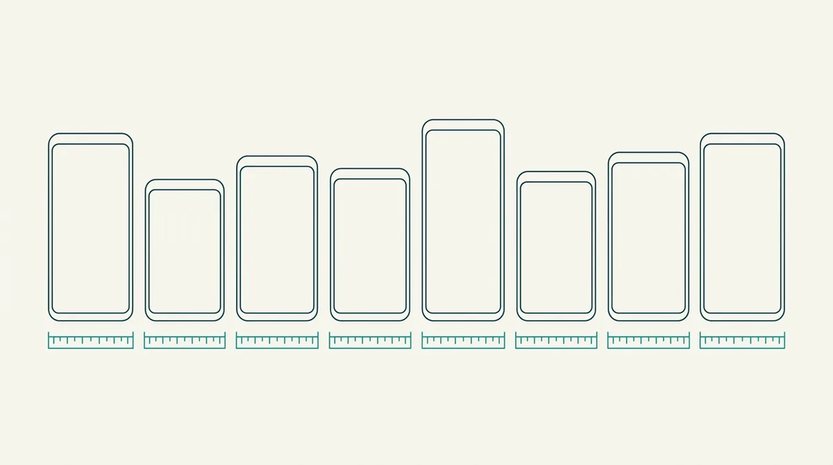
Capture at your device's native resolution, then place it in a frame with the same aspect ratio, then export at the size the store asks for. Most modern Android phones capture around 20:9, so a 1080 by 2400 capture drops into a 20:9 frame without distortion. A 16:9 frame will stretch it, and that stretch is visible even to people who cannot name it.
What size is an Android screenshot?
Quick answer: Whatever your phone's screen is. A screenshot is a pixel for pixel copy of the display, so a 1080 by 2400 phone produces a 1080 by 2400 file. The number that matters afterwards is the shape, not the size, because a frame built for a different shape will stretch your screen.
There is no single Android screenshot size. That's the honest answer and it's why this trips people up.
I read the current specifications for the common flagship phones before writing this, and I checked the worldwide resolution share rather than guessing which sizes actually matter.
The three sizes people confuse
Almost every mockup problem starts here, so it's worth separating them once.
The capture size is what your phone produces. The canvas size is what you design on. The export size is what the store accepts.
They are three different numbers and they are allowed to differ.
What is not allowed to differ is the shape of the capture and the shape of the hole in the frame. If those disagree, something gets squashed.
So the rule is short. Match the ratio, not the pixels.
What current Android phones actually capture at
Here are the real numbers on current flagships, which is what you'll be handed when somebody sends you a screenshot.
| Phone | Capture size | Roughly |
|---|---|---|
| Pixel 10 Pro | 1280 by 2856 | 20:9 |
| Pixel 10 Pro XL | 1344 by 2992 | 20:9 |
| Galaxy S25 Ultra | 1440 by 3120 | 19.5:9 |
| Typical mid range | 1080 by 2400 | 20:9 |
| Budget phone | 720 by 1600 | 20:9 |
Notice that the ratios cluster and the pixel counts don't. That's the important pattern.
Almost every modern Android phone is somewhere between 19.5:9 and 20:9. A frame built for that range fits nearly all of them.
The old 16:9 shape is long gone from phones, and a 16:9 frame is now the commonest cause of a stretched mockup.
Why the stretch is so visible
You would think a few percent of distortion goes unnoticed. It doesn't, and there's a reason.
Your screenshot is full of circles and squares. App icons, avatars, buttons, the loading spinner.
A circle that's two percent wider than it is tall stops being a circle, and human eyes are unusually good at spotting that.
So a stretched mockup doesn't read as slightly wrong. It reads as cheap, without the viewer knowing why.
Text suffers too. Letterforms are designed at one proportion, and stretching makes them look like a font nobody chose.
Fitting a capture into the wrong frame
Sometimes you genuinely have to, because the screenshot came from a phone you don't have a frame for.
You have three options and only two of them are acceptable.
Crop the capture to the frame's ratio, losing a strip from the top or bottom. That's usually fine, because the strip is status bar or navigation.
Or letterbox it, adding a band of background inside the frame. Less pretty, still honest.
Or stretch it. Never do this. It's the option every automatic tool picks by default, which is why so many store listings have subtly wrong proportions.
Fragmentation is worse than the table suggests
One number puts this in perspective.
The five most common mobile screen resolutions together cover only around a third of worldwide usage. The rest is spread over hundreds of variants, and you can see the live picture on StatCounter's resolution stats.
So you cannot design for the device your users have. There isn't one.
What you can do is design for the shape, which is stable, and let the pixel count vary underneath.
That is the whole reason the ratio matters more than the resolution.
Tablets and foldables break the rule
Everything above is about phones. Two categories don't follow it.
A tablet capture is much closer to square, often around 4:3 or 16:10. Dropping one into a phone frame is not a small mismatch.
A foldable has two shapes, an outer cover screen and an inner one that's nearly square when open. Both are real screenshots of the same app.
Google treats tablets and foldables as separate listing slots, so you're not choosing between them. You upload both.
We covered that separately in the guide to tablet and foldable screenshots.
Pick the canvas before you pick the frame
Here's a workflow that avoids the whole problem.
Decide your export size first, because the store fixes it. For Play Store phone screenshots, 1080 by 1920 or larger, in an accepted ratio.
Then choose a frame that fits inside that canvas with room for a caption and some background.
Then scale the capture into the frame, matching the ratio and cropping rather than stretching.
Doing it in that order means you never discover at the end that your design is 60 pixels too short.
Scale down, never up
One rule that keeps mockups sharp, and it costs nothing to follow.
Always capture at the highest resolution you can, then shrink the image into the frame. Shrinking throws away pixels and stays sharp.
Enlarging invents pixels, and the app text inside your screenshot goes soft. On a store page at thumbnail size that softness is exactly where it hurts.
So a capture from a 1440 wide phone is a better source than one from a 720 wide phone, even if both apps look identical on their own screens.
If the only capture you have is small, redo it on a better phone or an emulator set to a high resolution. It is faster than fighting the blur later.
Bezels count as part of the frame
A small point that changes how much space you actually have.
When you place a phone frame on your canvas, the frame is bigger than the screen inside it. The bezel, the rounded corners and the shadow all take room.
So a frame that is 1000 pixels wide might only have an 880 pixel opening.
That's the number your capture is scaled to, and it's the number that decides whether your app's own text is still readable in the final image.
If the text inside your app is too small in the mockup, the fix is usually a bigger frame rather than a bigger capture.
Which frame to choose when you have no idea
A short set of defaults that work:
- Android app, general audience: a modern Pixel frame at 20:9.
- App that skews Samsung, which is most of India and Korea: a Galaxy frame.
- Cross platform app with one asset set: a brand neutral frame, so you aren't implying a device you don't support.
- Tablet listing: a tablet frame, never a phone frame scaled up.
The frames page has the full list if you want to see the shapes side by side.
And whichever you pick, use the same one for all eight images.
Do not put a frame inside a frame
This one causes real store rejections rather than just ugly images.
If you capture a screenshot from an emulator window that already shows a phone outline, and then place that capture inside a frame, you get a phone inside a phone.
Apple's reviewers flag this. It also looks confusing at thumbnail size, which is where it does the damage.
So capture the screen only, with no device chrome around it, then add exactly one frame.
Emulator toolbars, window borders and browser chrome all count as chrome.
What to do now
Take one screenshot from your own phone and check its pixel size in the file properties.
Divide the height by the width. If you get somewhere near 2.2, you're on a 20:9 phone like most people.
Then open the editor, drop it into a frame of the same shape, and see whether the circles stay circular.
If they do, that template works for your whole set. Our guide to choosing a device frame covers the look rather than the maths.
Frequently asked questions
What resolution is an Android screenshot?
The same as your phone's screen. A 1080 by 2400 display produces a 1080 by 2400 file. There is no single Android screenshot size, which is why matching the aspect ratio matters more than matching the pixel count.
What aspect ratio do modern Android phones use?
Most sit between 19.5:9 and 20:9. A Pixel 10 Pro is about 20:9, a Galaxy S25 Ultra is about 19.5:9, and the common 1080 by 2400 mid range panel is 20:9. The old 16:9 shape has effectively disappeared from phones.
Why does my screenshot look stretched in a mockup?
The frame's opening is a different shape from your capture, and the tool scaled the image to fill it. Crop the capture to the frame's ratio instead, or pick a frame that matches. Never let a tool stretch it, because distorted circles and letters read as cheap.
Can I use one frame for every Android phone?
For phones, largely yes. A 20:9 frame fits nearly every current Android handset because the ratios cluster even though the pixel counts do not. Tablets and foldables are genuinely different shapes and need their own frames and their own listing slots.
Should the status bar be in my screenshot?
Either keep a clean one or crop it out, but never ship a messy one. A real battery percentage, a notification icon and a half connected wifi symbol all pull attention away from the app. Our guide to [capturing clean screenshots](/blog/capture-clean-app-screenshots) covers how to force a tidy bar.
Is a phone inside a phone a problem?
Yes. Capturing from an emulator window that already draws a device outline, then adding a frame, produces a phone within a phone. Reviewers flag it and it reads as confusing at thumbnail size. Capture the screen only, then add exactly one frame.
Build the mockup in your browser.
Drop a screenshot into a real device frame and export at the exact store size — free, no signup.